Cookie Packaging, Logo and Label Design by WDSOFT
December 18, 2023 2023-12-19 12:07Cookie Packaging, Logo and Label Design by WDSOFT
Cookie Packaging, Logo and Label Design by WDSOFT


About the Client
Nutramore is a well-known brand that produces delicious cookies and nutritious snacks. It was founded by an experienced nutrition expert who has over three decades of industry experience. The brand's cookies are not only tasty but also contribute to overall well-being. Nutramore has an unwavering commitment to maintaining impeccable hygiene standards, and its range of organic products offers a wide range of health benefits.
To revitalise its Cookie brand, Nutramore partnered with WDSOFT Food Branding Agency to undergo a comprehensive transformation that included logo design, packaging, and corporate stationery. To begin this project, our creative team conducted in-depth research on the product and its industry landscape. This research formed the foundation for our branding strategy, which involved creating mood boards filled with illustrations. The goal was to create a brand that would resonate with a diverse audience and highlight its universally positive health impacts.
Cookie Logo Design
At WDSOFT, our talented illustrators meticulously curated an illustration mood board featuring visuals that spanned different age groups. This concept aimed to embrace all segments of society and effectively communicate the product's versatile benefits. The brand's logo was designed to encapsulate the inherent organic essence of the product.
The logo seamlessly integrates the essence of the product with its name, encapsulating the primary identity of the brand. Centred around promoting health, the inclusion of a heart symbol subtly conveys the nutritional nature of the product, specifically healthy biscuits. Employing symbolism, the design adeptly communicates the health advantages, serving as a visual representation of the brand's commitment to well-being. The carefully selected colour palette not only aligns with the brand but also vividly mirrors the product, ensuring a visually cohesive and clear brand portrayal.
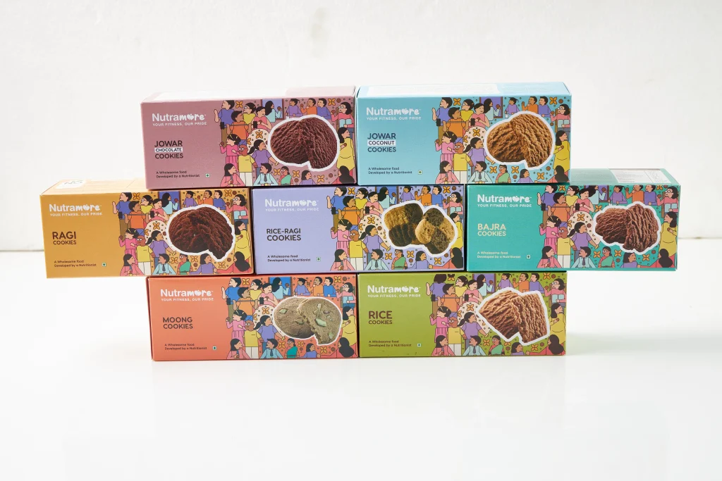
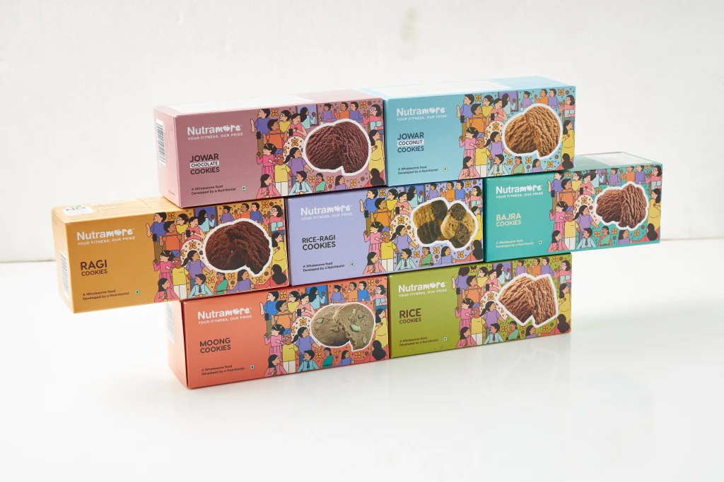
We successfully crafted an enticing logo and packaging that resulted in a strong brand identity. The packaging showcased illustrations of individuals from various age groups, symbolising the product's inclusivity and benefits for everyone. The intention behind crafting these characters is to convey that the product is suitable for individuals of all ages. These illustrated figures on the packaging symbolise the everyday people of the nation, showcasing their diversity while emphasising that everyone can enjoy these biscuits. This packaging played a crucial role in capturing customer interest, while the logo set Nutramore apart from its competitors.
Cookies are the favourite pass-time food in every household. We all have that one jar filled with cookies all the time as pastime food. Packaging plays an important role in making the customer choose the product. especially in the case of cookies. If you notice, you will realise that the packaging of cookies is exceptionally elegant and attractive, and once you glance at them, you never feel like buying anything else.
In the highly competitive consumer goods landscape, where initial impressions are paramount, packaging design becomes a pivotal factor in customer attraction and retention. Packaging serves beyond protection in the realm of cookies, beloved by all age groups; it's a dynamic canvas conveying brand identity and impacting purchase choices. This exploration into cookie packaging design examines the critical components that distinguish a package on the shelf, captivating consumers and etching a lasting impression. From visual appeal to messaging, we'll unravel the art and strategy behind crafting packaging that not only safeguards the delectable treat but also elevates the brand's presence in the fiercely contested market.
Understanding the Importance of Packaging
Packaging cookies goes beyond just transporting the products. It's a powerful marketing tool that can significantly contribute to the success of a brand. Cookie packaging not only protects the treats but also tells a brand's story, communicates its values, and connects emotionally with consumers. Designing the package is not just about making it look good; it's a strategic tool that influences how consumers perceive the product. An elegantly designed package can elevate cookies from being just confectioneries to an integral part of a brand experience that resonates long after the last crumb is savoured.
Key Elements of Effective Cookie Packaging Design:
- Visual Appeal: The first thing that catches a consumer's eye is the visual design of the packaging. Vibrant colours, delicious images of the cookies, and a clean layout can make a product stand out on crowded shelves. The design should be consistent with the brand's overall image and appeal to the target demographic.
- Branding Elements: A package is not merely a container; it's a brand ambassador. Incorporating the brand's logo, tagline, and other key elements in a visually appealing manner helps in building brand recognition. Consistency across various products within the brand creates a cohesive and memorable image.
- Functional Design: While aesthetics are important, functionality cannot be overlooked. The package must be designed to keep the cookies fresh, prevent breakage, and provide ease of use for the consumer. Innovative features such as resealable closures or easy-open tabs can enhance the user experience.
- Material Selection: The choice of packaging material is a critical design aspect. It not only affects the product's shelf life but also contributes to the overall sustainability of the brand. Consumers are increasingly conscious of their environmental impact, so using eco-friendly materials is not just a trend but a necessity.
- Typography and Text: Clear, legible typography is essential for communicating important information to the consumer. Nutritional facts, ingredients, and any other relevant details should be presented in a way that is easy to read and complements the overall design. The text should align with the brand's tone, whether it's playful, sophisticated, or minimalist.
- Storytelling: Beyond the basic information, packaging should tell a story. This could be the origin of the cookies, the passion behind the recipe, or the brand's commitment to quality. A narrative adds a human touch, creating an emotional connection between the consumer and the product.
- Seasonal and Limited Edition Designs: To keep things fresh and exciting, many cookie brands introduce seasonal or limited edition packaging designs. These variations can create a sense of urgency, driving sales during specific times of the year or for special occasions. It also allows brands to experiment with different creative concepts.
Innovative Shapes and Sizes: Departing from traditional rectangular boxes, some brands are experimenting with unique shapes and sizes. This not only adds visual interest but also facilitates product differentiation. Unconventional packaging can be particularly effective in niche markets where standing out is crucial.
About WDSOFT
We specialise in crafting captivating brand identities through Branding, Packaging, Label, and Logo designs. Contact us to elevate your brand presence, create lasting impressions, and stand out in the competitive market. Let our expertise drive your success with distinctive and memorable design solutions tailored to your business vision.

