Textile Logo Design
August 21, 2024 2024-08-22 10:26Textile Logo Design
Textile Logo Design
Solution Summary
WDSOFT designed a captivating and meaningful combination mark logo for an Indian textile company. We conducted extensive research on the client and the textile market to create an appealing logo that embodies the client's brand ideals and stands out in the industry. The symbol, font, and colours used in the final logo perfectly showcase the client's products and embody the essence of their company.
About the Client
'Knit Knot' is a subsidiary of Guru Laxmi Cottex Private Limited, a well-regarded textile company in Yavatmal, India. They have been providing high-quality, eco-friendly textile products to meet the needs of its customers since 2010. The client company places a high value on customer satisfaction and trust, and they try to maintain these values at every stage of the work process. Their textile company based in Maharashtra delivers their textile products all over India.
Client Expectations
As one of India's leading textile companies, the client desired to launch their subsidiary with a new logo and appropriate tagline. They were searching for the best Logo Design Company in India and hence approached us. The textile company asked for a combination mark logo to help the new subsidiary create its own brand identity. The client requested that the logo reflect their brand's principles and include a tagline representing their product. Furthermore, they wanted to print the logo's symbol on all of their products, which required it to be small but adequate and visually appealing.
Solution by WDSOFT
Analysis and Research
To create an attractive and meaningful textile company logo, our design team started with a thorough analysis of Indian textile companies and their logos. Our team also held an extended discussion with the client to understand the client's target market, brand history, and unique selling propositions. This approach made it easier to fully understand the Indian textile industry market and the client's goal of designing a logo that reflected their business and core values.
Design
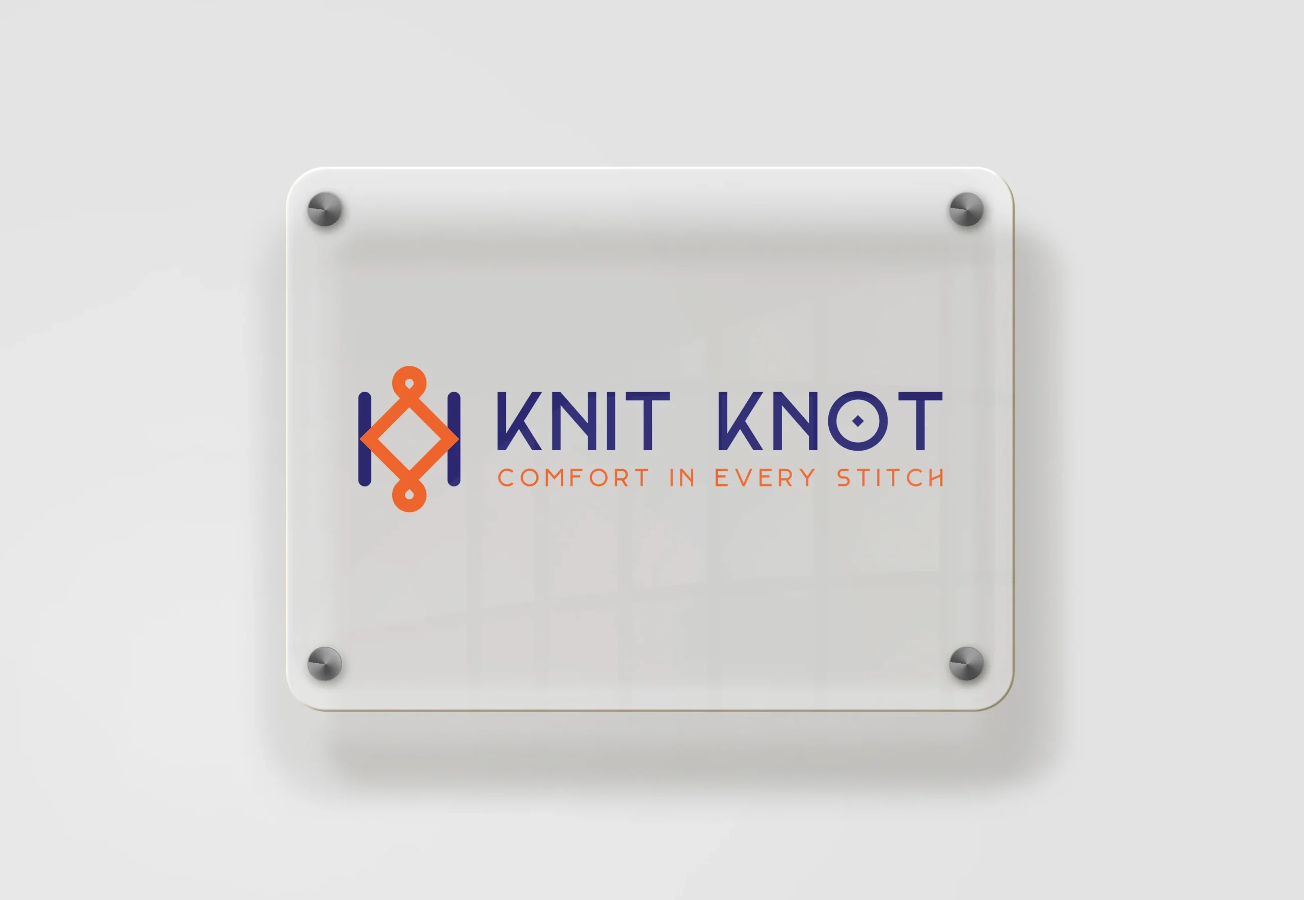
As per the client's needs, our team created a combination mark logo that is simple yet elegant and communicates the brand's core values. The logo's symbol shows a thread knot forming a square, representing the completion and craftsmanship of clothing. The square shape symbolises infinity, highlighting the brand's stability and excellence. Additionally, the two lines beside the square represent needles. The two "K" letters face each other with their lines extending outward, symbolising pathways to growth and progress.
Color Palette and Typography
The bold and modern font used for the brand name ensures readability and reflects the brand's commitment to excellence and innovation. The tagline, written in a smaller, uppercase font, is an appropriate match to the brand name and logo. We delivered the final logo in various colour patterns, from bright to light shades, to meet the client's desire for a versatile logo. Our designers used two complementary colours in each combination to create a logo that is visually appealing and easy to read.
The final logo design effectively captured the essence and values of the client's company. The client was pleased with the final logo, particularly appreciating the logo's colour flexibility, and praised our design process.


