Real Estate Logo & Brand Identity Design Services
November 15, 2020 2023-11-23 10:58Real Estate Logo & Brand Identity Design Services
Real Estate Logo & Brand Identity Design Services
WDSOFT is a Pune, INDIA-based Branding Agency that specializes in Real Estate Brand Development & Reach. We leverage our Design, Digital/Outdoor Marketing & Advertising expertise, to transform Real Estate Businesses. Please check some of our recent Real Estate brand development case studies below.
Real-Estate Branding Case Study for Green Valley
Social Media Marketing
Billboard Design
Ads Design
Real-Estate Branding Case Study for Dharma
Social Media Marketing
Real-Estate Branding Case Study 1
Logo Design for Green Valley Real Estate Company in Pune
Green Valley [Green-Valley. in] is a Real Estate Company based in Pune. The real estate company sells farmhouse plots in the scenic location of Panshet Dam, Pune. The client approached us with the requirements of brand identity design [logo design], outdoor & print media advertising, website design, social media & digital marketing.
GREEN VALLEY PANSHET, as the name suggests, brings you closer to nature. Our creative logo designers wanted to preserve it in the real estate logo to support consistency. The creative process of logo designing begins with vigorously searching for an idea. While the logo design for real estate was being developed, we were inspired by the idea of building a house or a farmhouse away from the bustle of Pune city life.
Our designers created an efficient typography logo design for the real estate company. In the real estate logo, the text, GREEN VALLEY, is displayed in deep green which symbolizes nature and provides excellent color contrast to the logo. In the text, the letter 'G' features a luxurious home icon that depicts a home nestled in a valley surrounded by nature. The logo design for real estate uses a creative, modern, and eye-catching font. The real estate logo truly reflects the picturesque landscape of the property.
The goal was to create a real estate logo that catches customers’ attention enduringly and gives them a unique identity.
Real-Estate Branding Case Study 2
Brand Identity & Marketing Collateral Design for "Surya Builders"
Surya Builders - An infrastructure startup in Pune & Baramati approached us for a total branding solution. Being the top Branding Agency in Pune, we came up with a 360-Degree Brand Development campaign for the Real Estate Company. The project included logo design for the real estate company, branding collateral design, outdoor banner design, hoarding design, brochure design, and visiting card design.
Logo Design for Surya Builder
Our logo designers created a fitting logo design for a real estate infrastructure startup that depicted the rays of the sun. The "Sun" theme was adopted to reflect upon the name of the business "SURYA" - i.e. SUN. The logo design for real estate is created using red and orange colors to signify a new beginning, energy, power, pleasure, and fun.
Significance of Colors in Real Estate Logo
Given the "CONSTRUCTIVE" nature of the business and the name "SURYA", our logo designers created a logo design for real estate in three colors - Orange, Red, and Black. Orange is an attention-grabbing color that depicts activity and signifies energy, enthusiasm, and vigor. As with orange, red also catches the viewer's eye. These colors represent power, energy, speed, and spontaneity. Above all, the red color signifies the adrenaline rush - a perfect color attribute to reflect the character of the business. The black color in the logo design for real estate represents sophistication, luxury, glamour, and exclusivity.
Black is also a dominant color in the marketing collateral design as it stresses sophistication - the prime characteristic of the client's audience.
Real Estate Logo Text
The Logo text comprises the business name "SURYA BUILDERS" in Sans Serif to reflect unprofessionalism and business ethos. And the slogan "home for real comfort" in script font represents emotions.
The symmetry of the Logo
The Surya Builders logo design for real estate maintains a horizontal symmetry. The upper part of the logo design for the real estate company features the initial alphabet of the business name "S" radiating orange color rays. The name of in business SURYA BUILDERS is in black, split by a thick orange-colored line between them.
Marketing Collateral Design for the Real Estate Company
Hoarding
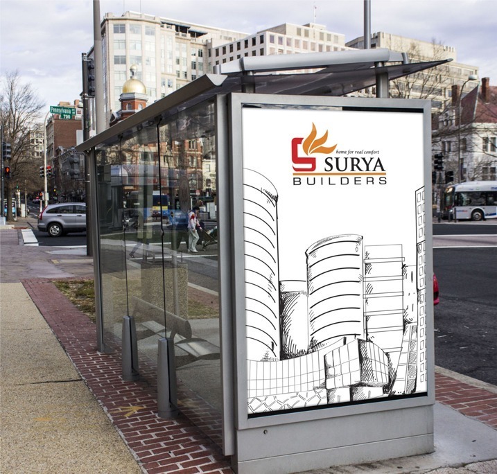
WDSoft Pune's graphic design team created stunning hoarding designs that would instill trust and confidence in the minds of the real estate company's target audience. The graphics our designer created have rich high-rise building images with contrasting colors to capture the attention of the prospects.
Branding/Marketing Collateral
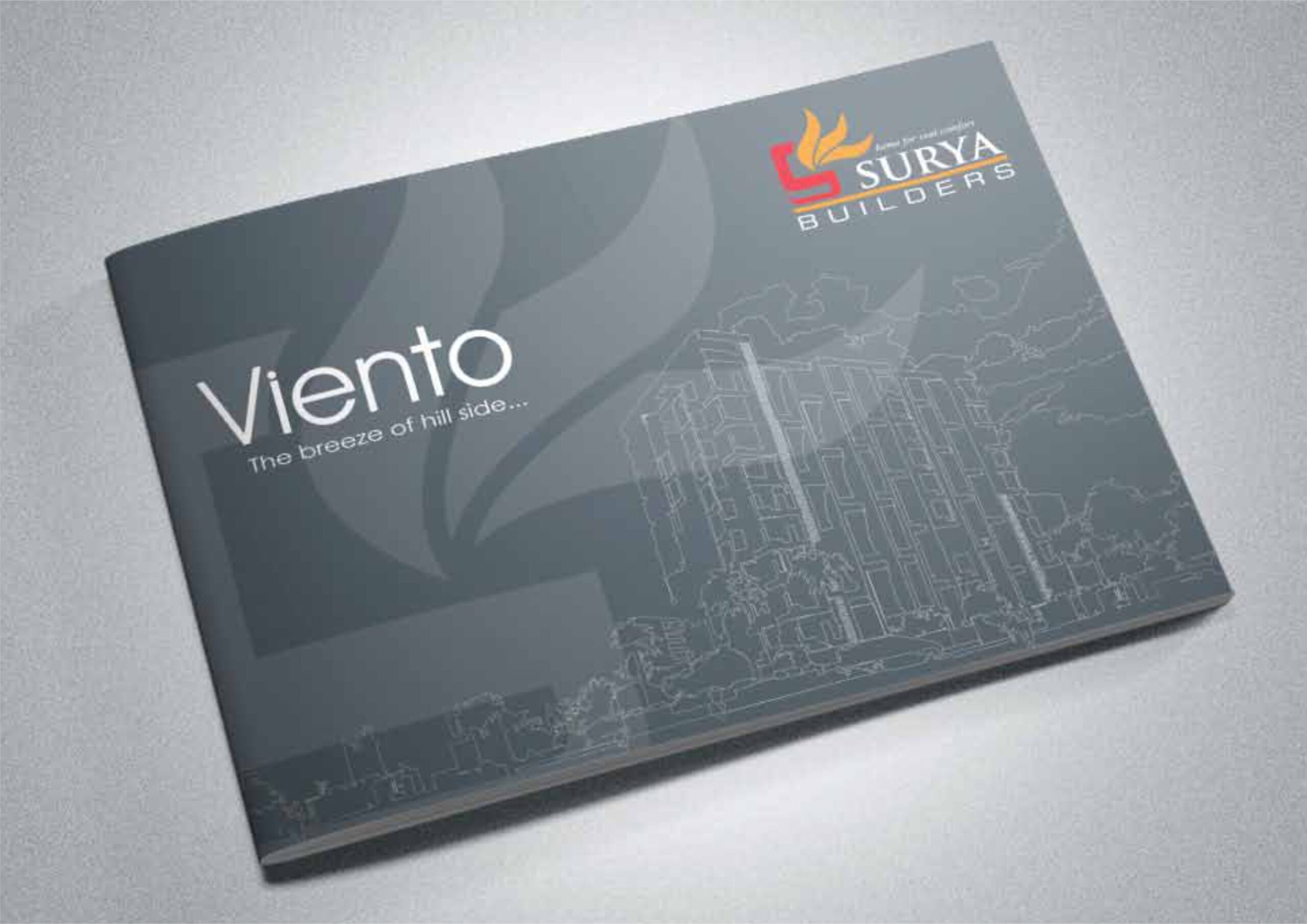
We designed a wide range of branding collateral for Surya Builders. This included brochures and marketing collateral such as diaries, letterheads, visiting cards, etc. To give it a touch of elegance and sophistication, our graphic designers used black color prominently to reflect the lifestyle of the prospects.
Digital Walk-through and Visualization
Our video production team created this beautiful walk-through video to give potential home buyers a real-life feel of the interior of the apartments and building. The 3-minute-long visualization covers all the aspects of Surya Builder's TARANGAN real estate housing project and its surroundings. The walk-through video gives an enormous boost to the brand identity of Surya Builders and instills trust and confidence in the mind of prospective buyers.
Results
Having designed branding campaigns for all the marketing channels, Surya Builders were able to generate a good amount of leads which subsequently converted into buyers.
Real-Estate Branding Case Study 3
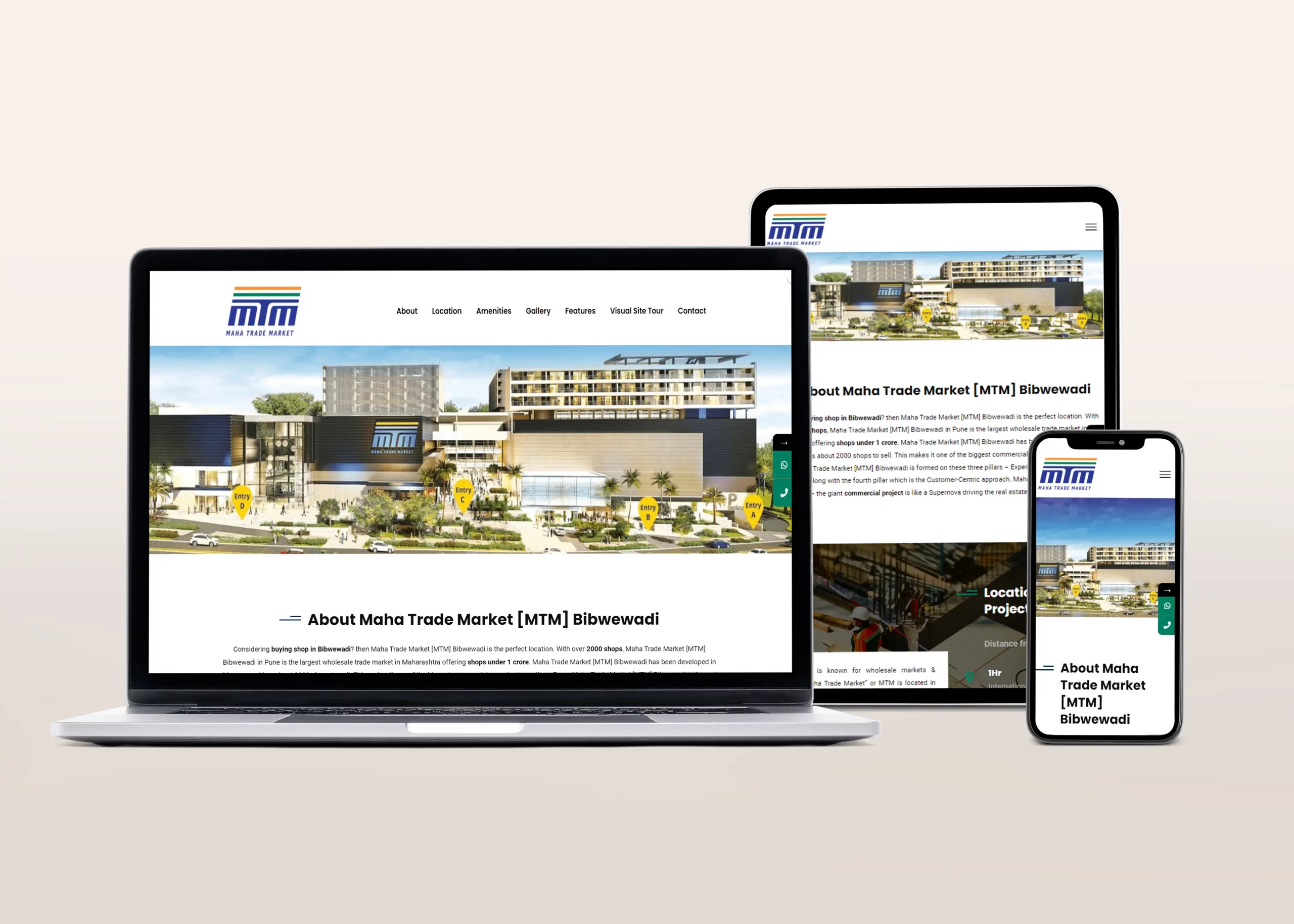
Logo Design for Real Estate Channel Partner Firm "Dharma"
"Dharma" is in partnership with Pune’s fastest-growing, largest wholesale trade market, "MTM Pune” Maha Trade Market in Bibwewadi, Pune, Maharashtra. The real estate agency wanted us to design their logo and generate leads for their properties using digital marketing media.


