College Logo Design and Corporate Video – Case-study for Minerva College
November 15, 2020 2023-03-22 11:02College Logo Design and Corporate Video – Case-study for Minerva College
Logo Design and Corporate Video for Architecture College
Minerva Website Design
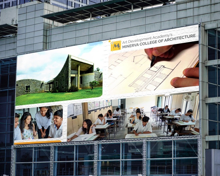
Minerva Hoarding Design
Minerva Corporate Video
Branding Challenge
Minerva College of Architecture was finding it hard to make their presence felt in the technical education field. The College Management wanted us to elevate the image of the college and portray it as a better alternative to the other educational giants. We were hired by Minerva College of Architecture to provide a solution to this situation.
Our Response:
Logo Design for the College: The first branding activity we conducted was the redesigning of the Minerva College's logo redesigning. Our aim was to design a college logo that reflects on the character of the organization.
Meaning of the word "MINERVA": The name Minerva is a girl's name of Latin origin meaning "of the mind, intellect". The term is used for The goddess of handicrafts, widely worshiped and regularly identified with Athene, which led to her being regarded also as the goddess of war.
Logo colors: The colors used are yellow . gray and black. Yellow, the color of sunshine, hope, and happiness, stands for freshness, happiness, positive vibes, clarity, energy, optimism, enlightenment, remembrance, intellect, honor, loyalty, and joy while black is a solid color which represents strength, seriousness, power, and authority while gray is reserved for formal, conservative, and sophisticated.
Logo shapes: Squares are the default shape for most projects for a reason. This common shape creates a sense of equality and conformity. The familiar shape is seen as stable and trusting. The square further relates to the earth, with each of the four corners relating to the four points on a compass. Sharp edges suggest stability in more practical terms and can also be used to imply balance. Straight lines and precise logo shapes also impart strength, professionalism and efficiency.
Website Design for College
We developed a handsome RESPONSIVE (mobile/smartphone-friendly) college website focusing on the infrastructure, facilities, vision and motto of the college. The alluring graphic and content rich college website is created using WordPress Content Management System and an educational theme. Our goal was to design a college website that highlights the key features of the college like:
- Infrastructure of the College
- Fully Furnished Multimedia Classrooms
- Ultra-modern Labs, Workshops and Studios
- Student Oriented Curriculum and Placements (with numbers)
- Experienced and Proficient Faculty
- Approvals by Various Government Authorities
- Academics and Admission
- Alumni and Achievements
- Guest Lectures by Experts, Workshops and Study Tours to various Architectural Monuments
- Events, Sports and Various Extra-curricular activities conducted by the College.
The website highlights suitable and pertinent pages for every one of these things. To give a "useful" vibe to the website, the photographs utilized in the site were really taken shots at the school grounds. The pictures delineate different school exercises highlighting understudies, employees, and school offices. The record page of the school site includes a clear 6-photograph slider that gives a review of the College.
Content Writing
Our content writers created the opulent "About Us" content for the Architect College website. The "About Us"content touches all the aspects of the Architect College - architectural heritage, knowledge and wisdom, college ethos, values, vision and mission, academics, approvals by competent authorities, state-of-the-art facilities, well equipped labs and library, skilled and accomplished faculty, infrastructure and recreational activities. The same content theme is also used for the Video voice-over content.
Brochure Designed by WDsoft Pune
Our graphic design team designed an eloquent brochure for the Architect College. The matte laminated brochure contains radiant images and catchy content. Like the website, the brochure highlights the capabilities, tranquil surroundings and scene campus of the College. The brochure also focuses on the infrastructure of the college which in itself is an architectural marvel.
Promotional Video
Our Video Making team created a promotional video with affluent voice-over content, covering all the particulars of the college mentioned above. The beginning part of the video was shot using a drone camera giving a bird's eye view of the 3 acre landscape of the college. The video covers the various affairs of the college, students and faculty. The video contains footage from classrooms, computer lab, workshops, studio etc. While making the promotional video our focus was to highlight the "designing" dimension of the academia, hence the video contains actual footage of students and faculty member engaged in various activities related to Architecture like team-work, planning, drawing sketches, group-discussion, designing etc. Towards the end of the video the theme moves towards recreational and sports activities of the college. The various scenarios in the video are backed by relevant on-screen captions. At the end the video shows logos of the competent approving authorities (Government Of Maharashtra, Council of Architecture, Department of Technical Education and University of Pune) along with data about years of academics, faculty strength and number of students passed out from the college.


