Geet Creations Boutique Pune
Geet Logo Design | Geet Corporate Identity Design | Geet Illustration Design |Geet Internal Branding Design | Geet Flayer Design | Geet Brochure Design | Geet Packaging Design | Geet Billboard Design | Geet standee Design
Geet Logo Design
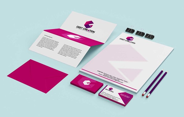
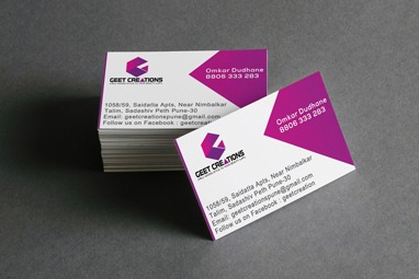
Geet Corporate Identity Design
Geet Packaging Design
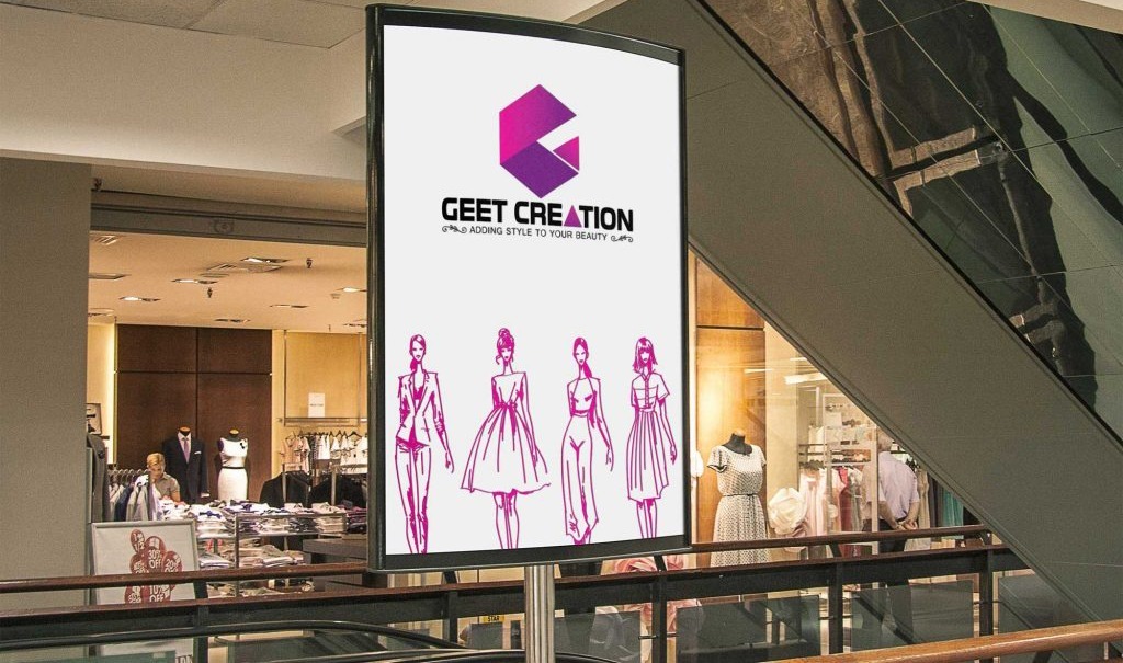
Geet Billboard Design
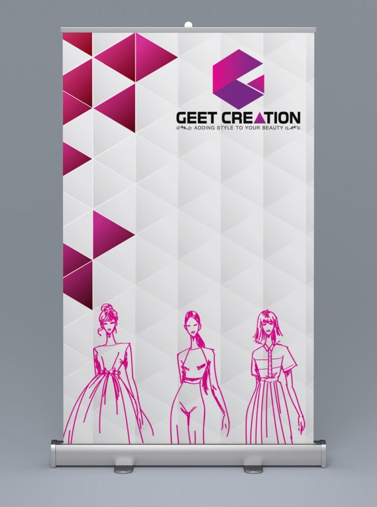
Geet standee Design
Branding Challenge
This small but beautiful fashion boutique in Pune needed to give itself a complete makeover in order to stand out amongst other big fashion outlets in the vicinity. Their goal was also to create brand awareness amongst the urban women of the city.
Logo Designing for the Geet Creations Boutique
Staying true to our motto, "Big enough to deliver, small enough to listen", our logo design team studied the minutest of details before crafting the logo and marketing collateral.
The first branding activity undertaken for the clothing boutique was the "logo design". Our logo designers at WDsoft branding agency were quick to come up with a swanky logo sketches and color scheme for the boutique logo.
Our designers created the boutique logo with the alphabet "G" depicted in a "Stiff-Staff" font style with a paper fold effect. The edgy Stiff-Staff font style gave the alphabet "G" an urban, stylish and modern look that complimented and blended with the internal branding of the boutique.
Logo Colors
Magenta and Violet colors were to be the main theme of the branding and collateral design and the same colors were also to be used in the boutique logo.
Magenta
color is associated with luxury, power, harmony, wisdom and balance
Violet
color signifies femininity, royalty, prestige and nobility.
Our graphic designers are well versed with the target audience of an urban fashion boutique and hence this color combination for the logo (and branding) was chosen.
The font style, effect and the two-tone color made the logo look rich and sophisticated and gives the logo a 3D effect.
Logo Text and Slogan
The text Geet Creations and the slogan "Adding Style to your Beauty" was added to the logo. The alphabet "A" in the word CREATIONS is given an opaque effect with the same 2 tone color used in the logo. This further enhances the look of the logo.
Graphic Design for Internal Branding
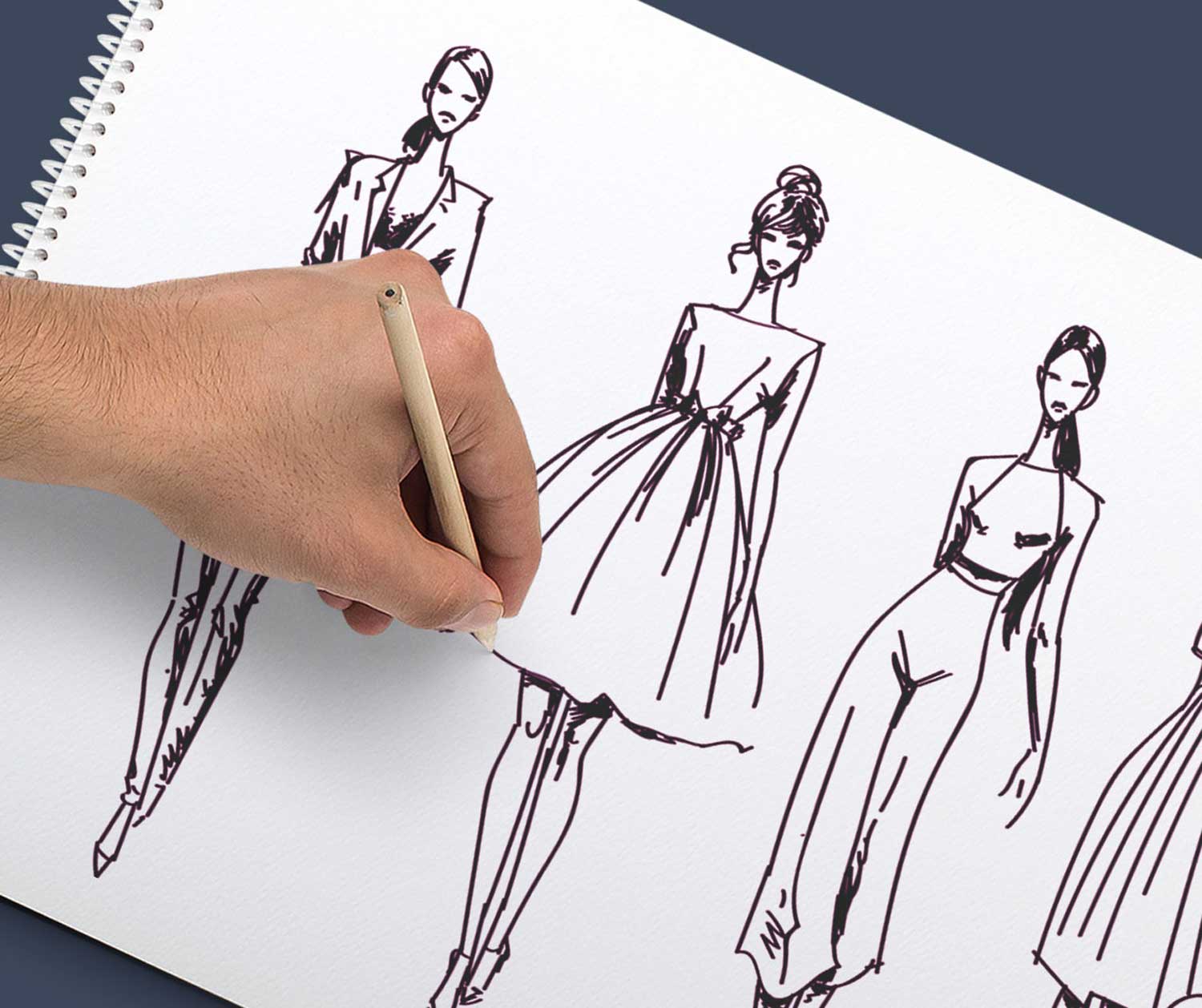
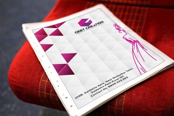
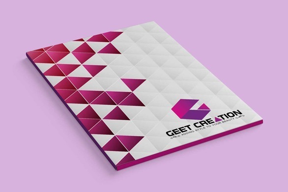
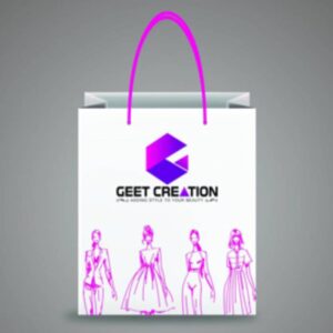
The interior marking of the boutique was done in similar hues against a white foundation. The visual computerization highlights rhombus and triangle shapes toward the start of the divider, trailed by representations of female models wearing different outfits. The rhombus connotes "speed" and considers the urban way of life. The rhombus shapes are consistently isolated into fuchsia and violet hues.
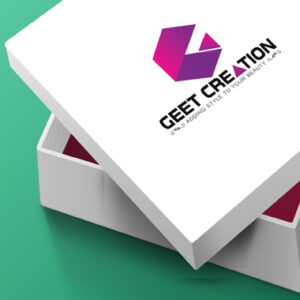
The same theme was adopted in designing the posters, standees, carry bags, signboards, gift-boxes, brochure/catalogue, advertising pamphlets, office stationery and magazine advertisements.
Result
The outcome was obvious – Geet Creation Boutique's brand and visibility grew manifold. The branding makeover was a complete success and met all mission objectives. There was a sharp increase in the number of targeted visitors most of whom converted into customers. The branding campaign had done its job.


